I couldn’t find a sketch for this one. It was painted in 2006 along with the idea of factory type settings. Crumbling to the ground and being consumed be the natural world, these rooms are still breathing in a very quiet passage of time. The interior of the old mill building I used to work in set the mood for the image. What was before, no longer is. We can see it though, shape shifting into a beautiful world of decay. The large sinks are for washing out a fabric of some sort. The floors and windows are gleaming as if still wet, dripping with colors of turquoise, lemon yellow, sap greens and bits of lavender highlighting
 My favorite hobby is dyeing fabric in the batik style. Wax is used as the resist. There are multiple dippings of the fabric into a vat of water with soluble dyes. Where ever the wax has been applied, no dye can penetrate, leaving you with the color beneath. With this method, you can create any kind of image, considering how many dyeings and waxing applications you do. After you boil the wax off, a beautiful pattern emerges. It is a fantastic challenge. Completely unpredictable, similar to developing your own photographs as you’re never certain how they will turn out.
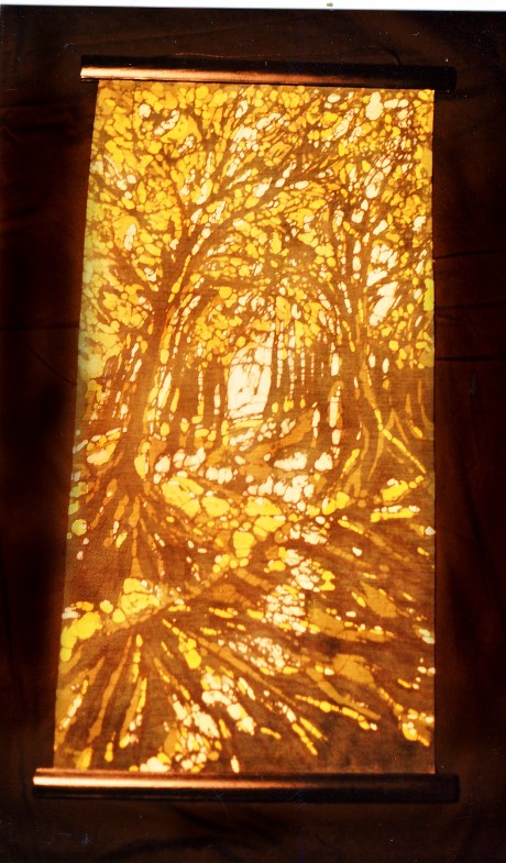
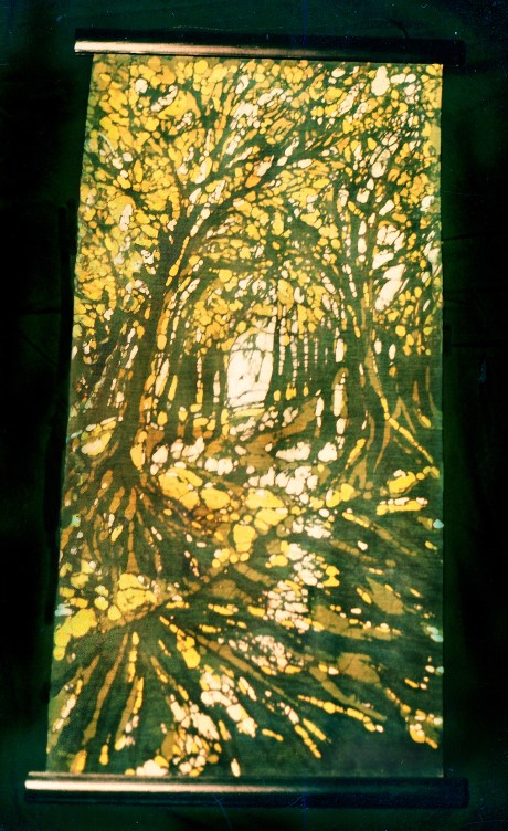
I did this piece as a secret Santa in 2002? and of course procrastinated like crazy. I think I finished that night and realized I should take a picture of it before it goes forever. Unfortunately, I didn’t have a flash with my camera because I was using a manual one at the time. So, I used a spot light tethered to the top of the fridge, which made the light source a little uneven. Putting out a black bed sheet on the kitchen floor, I laid the wall hanging on it and stood on a stool to take the picture. Hence, the golden glow. In photoshop I tried to get it back to its original shades of olive greens and dusky browns.
Usually, a piece will take many tries to get the desired result, this one, however was amazing, everything went well and I only had to do one trial run. I think it’s because I sketched it out several times, going over and over the intent and of course the color sequence: cream, yellow, greens and browns. The purpose of the piece was to get an emotional light streaming through the tree trunks. After the dyeing was completed, I used strips of black wood paneling back to back with the fabric sandwiched between on the top and bottom as a kind of frame for hanging cloth.
A while ago, my mom gave me her batik book by Ila Keller, written in 1966. I love its thick yellowing pages, black and white photographs and really bold, simple designs. It’s one of the best batik books published.
She goes over the Javanese history of Batik and has such concise methods of attaining a really great design. There’s a lot of trial and error involved, but totally worth the effort.
 In the diagram below, she shows how you start out by drawing your design on the fabric and then compiling the dye information for testing. Bees wax can be used, although I like a paraffin and bees wax combination on a cotton/ linen cloth. Very hot wax is brushed on the cloth or, if you’re using a tjanting tool, you would draw your image on the fabric like using a pen. The cloth is then submerged into a dye bath. Since the wax is not penetrated, your shape will stay intact. The more dyes you use, the more depth you can receive.
It would be my dream to have a studio with hot running water and a stove to do this art. I don’t have a basement in my current home like I used to, so I’ve had to use my little bathroom and kitchen the past couple of times.
These pieces evaporate during the day because of the sun’s blue light. When it shines across the wax, a dulling effect takes place to the surface. The midday sun hides the color, but it brings out the texture, causing you to stop and look very closely at the detail.
Then as night comes, incandescent lights are turned on and the painting appears entirely different. Regular light bulbs give off a yellow glow, making the painting’s hues appear deeper and rich with color. I took this picture at night with a flash.
The previous two versions are posted on October 9th where the shadows are lighter and the left wall does not exist.
The darkness surrounds the paintings as much as the light, but it is the light that lets you enter further. When painting, I feel as though I’m trying to get through slabs of concrete, yet the challenge is satisfying and it keeps me going.
That’s probably why there’s this heavy resting moment in each piece of work. The image is tinged with melancholia, although not without a feeling of resolution.
It seems as though when working, I always look at the image as if it were something in the past, something you know only partly of, but I think that the paintings come out with a sense of future as well. The sketches are of a being called an opperatant who is learning about the end of one’s life and the beginning of another.
There was a color theme I was trying to convey that was inspired by the children’s book, Sam and the firefly written and illustrated by P.D. Eastman. Because the story takes place at night, the background color was dark, but it was this hospital green with a contrasting bright yellow for the firefly’s body. For some reason those colors stayed in my mind and it was important to use them. I’m not really sure why yet. P.D.’s illustrations
This painting took forever to get it just the way I wanted it. At one point I took the canvas outside in the blazing summer sun and let the wax melt and then stripped the oils and primer off. I went over it many times with water wax, (wax that’s boiled with water creates bubbles and circles when applied to the canvas.) gesso and oils. Almost giving up on the whole thing, I just let it sit for a while and then it started to grow on me. My sister now has this in her dinning room and when I saw it again several years later, the picture looked so different, much brighter and more chaotic than I remembered.
That feeling of wanting to flee brought about the idea of this painting. I wanted it to come across mostly as an abstract with a vibrancy and rawness. If the image were music, it would be free jazz.
Sketching the piece worked out pretty quick and all the while, thinking I’d make this one huge, at least sixty inches high.
The figures are wispy little things running to something much better.
Their hope and inspiration are flying high shown by the white sheets blowing in the wind.
Texture is built up and cracking everywhere.
Tonight, after going over some work, I realized where the “unknown” theme began, here with these paintings done in 1998 and 99. Light and space are the only elements in the paintings, emanating the feeling of “past” which asks, ‘what has been here before?’
As I proceed, in 2008, the walls series takes on much more detail in “another way”.
When I was working in an old mill building in Easthampton, Mass., there were these windows with vines growing over the glass panels and when the sun shone through, a luminous green would fill the space. It always reminds me of buildings in decay, places lost in time while being grown over by earth. I made a few sketches of this purely fictional scene, but the over all piece took lengths of time for the coloring to fall into place.
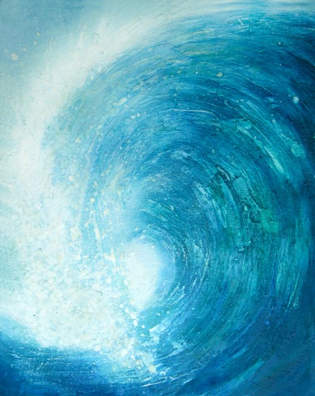
Every so often I paint waves. It’s kind of a release from the other paintings. They’re done in the same way and still fall into the category of semi-abstract. They are painted to sell, and are smaller, around 16″ x 20″. The first group of them made it into a tiny deli in downtown Portsmouth and then later made their home in a massage pallor, coincidentally, called Waves . It wasn’t until showcasing on eBay that they sold and had a small following. Keeping up the task of painting waves was not exactly easy. It quickly turned into a job and I felt like getting back to the really creative, imaginative stuff.


